Chapter 4 Modeling Univariate Time Series
4.1 Introduction
We present a real data illustration of a univariate time series using R-INLA. In Section 4.2, we describe the data (Musa 1979).
Sections 4.2.1–4.2.4 describe fitting different DLMs to the data. In Section 4.3, we obtain forecasts of future states and realizations. We then discuss model selection using both in-sample criteria based on
adequacy of fit and out-of-sample criteria based on accuracy of forecasts.
As we did in Chapter 3, our custom functions must be sourced so that they may be called throughout the chapter.
source("functions_custom.R")The following R packages are used in this chapter.
library(tidyverse)
library(readxl)
library(INLA)
We analyze the following data set.
- Musa data – a software engineering example
4.2 Example: A software engineering example – Musa data
During the software development phase, software goes through several stages of testing with the purpose of identifying and correcting “bugs” which cause failure of software. This process is referred to as debugging. Since it is expected that the debugging process improves the reliability of the software, such tests are known as reliability growth tests in the software engineering literature. Singpurwalla and Soyer (1992) consider modeling the time between failures in a software debugging process and discuss how the analysis of such data provides insights about assessment of reliability growth. The authors use system 40 data from Musa (1979), which consists of observations on the times between failures over \(n=101\) testing stages.
We use a function from the readxl package to read the data from an xlsx file into R.
Alternatively, one can also convert the data to a csv file and read it into R using the read.csv() function.
musa <- read_xlsx("MusaSystem40Data.xlsx")
head(musa)
## # A tibble: 6 x 1
##   `Time Beween Failures`
##                    <dbl>
## 1                    320
## 2                  14390
## 3                   9000
## 4                   2880
## 5                   5700
## 6                  21800
Let \(y_t\) denote the logarithms of the times between software failures, \(t=1,\ldots, 101\). Figure 4.1 shows a plot of \(y_t\) which exhibits an increasing trend over time, suggesting potential reliability growth.
musa <- musa %>%
  mutate(log.tbf = log(`Time Beween Failures`))
tsline(
  musa$log.tbf,
  xlab = "t",
  ylab = "log inter-failure time",
  line.size = 0.6,
  line.color = "red"
) 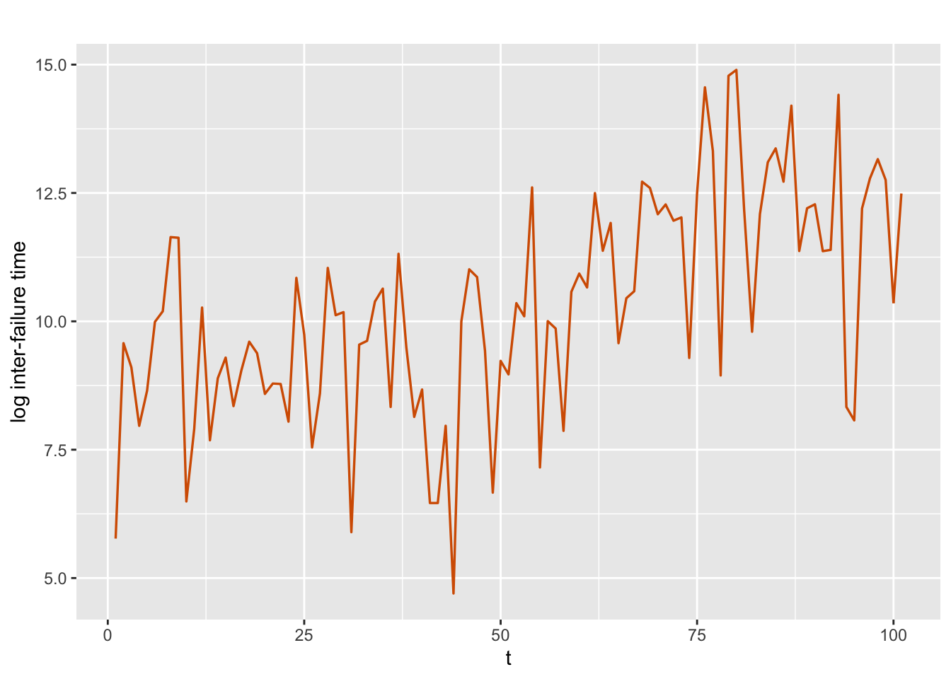
FIGURE 4.1: Logarithms of times between software failures.
We split the time series into a training (or calibration, or fitting) portion consisting of the first \(n_t=95\) observations, and a hold-out (or test, or validation) portion consisting of the last
\(n_h=6\) observations, with \(n=n_t+n_h\).
Under each model, we fit DLMs to the training data and use the fitted model to forecast the hold-out data. Recall that in R-INLA, there is no separate forecasting function like the predict() function in the stats package. Therefore, we append the end of the training data (of length \(n_t=95\)) with NA’s to represent the times to hold-out (the last \(n_h=6\) data points). The vectors id and y.append shown below each has length \(n=101\).
n <- nrow(musa)
n.hold <- 6
n.train <- n - n.hold
test.data <- tail(musa, n.hold)
train.data <- musa[1:n.train,]
y <- train.data$log.tbf
y.append <- c(y, rep(NA, n.hold))
Singpurwalla and Soyer (1992) point out that modifications made to the software at different stages of testing may potentially deteriorate the software’s reliability even though the intention is to improve it. As a result, the expected time to failure of the software from one period to the next may not necessarily increase. This dynamic nature of the mean time to failure needs to be taken into account in modeling the behavior of times between software failures.
In Chapter 3, we described how to fit a DLM of the form
\[\begin{align} y_t & = \alpha + x_t + v_t, \tag{4.1} \\ x_t &= \phi x_{t-1} + w_t, \tag{4.2} \end{align}\] where, \(\phi=1 \, (|\phi| <1)\) gives us a random walk (AR(1)) model, and \(\alpha\) denotes the level. In (4.2), the state variable \(x_t\) enables us to capture the dynamic behavior of the mean time to failure in the Musa data as a result of modifications made to the software at each stage. For example, when \(\phi=1\), the model implies that the mean is locally constant and the effect of modifications will be reflected by the magnitude of the state error variance. In other words, higher values of the state error variance will suggest a more drastic effect of modifications on the reliability of the software. By looking at the posterior distributions of \(x_t\) at each stage \(t\), we can examine such behavior.
4.2.1 Model 1. AR(1) with level plus noise model
We fit an AR(1) with level plus noise model shown in (4.1) and (4.2) with \(|\phi| <1\) to the training data of length \(n_t\).
id.x <- 1:length(y.append)
musa.ar1.dat <- cbind.data.frame(id.x, y.append)
Recall from Chapter 3 that id.x helps us to specify the random effect corresponding to the state variable \(x_t\). The model formula and the inla() call are shown below.
formula.ar1 <- y.append ~ 1 + f(id.x, model = "ar1")
model.ar1 <- inla(
  formula.ar1,
  family = "gaussian",
  data = musa.ar1.dat,
  control.predictor = list(compute = TRUE),
  control.compute = list(
    dic = TRUE,
    waic = TRUE,
    cpo = TRUE,
    config = TRUE
  )
)
We show posterior summaries of the fixed and random parameters. The user may also obtain a complete summary using summary(model.ar1).
# summary(model.ar1)
format.inla.out(model.ar1$summary.fixed[,c(1:5)])
##   name      mean  sd    0.025q 0.5q  0.975q
## 1 Intercept 10.02 0.869 8.155  10.03 11.78
format.inla.out(model.ar1$summary.hyperpar[,c(1,2,4,5)])
##   name                       mean  sd    0.5q  0.975q
## 1 Precision for Gaussian obs 0.416 0.070 0.411 0.567
## 2 Precision for id.x         0.713 0.423 0.621 1.783
## 3 Rho for id.x               0.955 0.031 0.962 0.992
As we also discussed in Chapter 3, Precision for id.x value in the output
does not refer to \(1/\sigma^2_w\), but to \(1/\sigma^2_x\), the precision of \(x_t\) in the stationary AR(1) process. To recover the posterior mean of the distribution of \(\sigma^2_w\), we must use
sigma2.w.post.mean <- inla.emarginal(
  fun = function(x)
    exp(-x),
  marginal = model.ar1$internal.marginals.hyperpar$`Log precision for id.x`
) * (1 - model.ar1$summary.hyperpar["Rho for id.x", "mean"] ^ 2)
print(sigma2.w.post.mean)
## [1] 0.1736
In this model, the fitted values are the means of the smoothing distributions of \(x_t\)’s and provide us with an overall assessment of modifications made to the software. The upward trend in the posterior means of \(x_t\)’s suggests an overall improvement in software reliability as a result of the modifications. However, to assess the local effects from one stage to another, we must look at the means from the filtering distributions of \(x_t\)’s. We compute the filtered means of \(x_t\) using code from the custom functions that we sourced, and then plot these along with observed \(y_t\) and smoothed estimates of \(x_t\) from Model 1; see Figure 4.2. We can recover the fitted values of \(y_t\) using the code
# model.ar1$summary.fitted.values
format.inla.out(head(model.ar1$summary.fitted.values))
##   name         mean  sd    0.025q 0.5q  0.975q mode
## 1 fit.Pred.001 8.711 0.749 7.133  8.748 10.09  8.824
## 2 fit.Pred.002 8.872 0.661 7.519  8.889 10.13  8.926
## 3 fit.Pred.003 8.953 0.621 7.695  8.965 10.15  8.989
## 4 fit.Pred.004 9.010 0.599 7.798  9.019 10.17  9.038
## 5 fit.Pred.005 9.149 0.582 7.995  9.149 10.30  9.150
## 6 fit.Pred.006 9.328 0.585 8.210  9.315 10.52  9.289
and the smooth estimates of \(x_t\) from the code
# model.ar1$summary.random$id.x
format.inla.out(head(model.ar1$summary.random$id.x))
##   ID mean   sd    0.025q 0.5q   0.975q mode   kld
## 1 1  -1.304 1.047 -3.483 -1.272 0.726  -1.201 0
## 2 2  -1.144 1.010 -3.226 -1.125 0.847  -1.084 0
## 3 3  -1.062 1.000 -3.114 -1.049 0.928  -1.021 0
## 4 4  -1.006 0.998 -3.045 -0.996 0.994  -0.975 0
## 5 5  -0.867 1.000 -2.899 -0.864 1.153  -0.858 0
## 6 6  -0.687 1.013 -2.734 -0.692 1.374  -0.707 0
As expected, the posterior means of the filtering distribution of the state variable, which capture the effects of the modifications at each time period, show more variation than the smoothing distribution means, and follow the local trends in the observed data more closely. Note that the gap between the posterior means of the filter estimates of \(x_t\) and the observed series is due to the presence of a level \(\alpha\) in the model. The posterior mean of \(\alpha\) is 10.015.
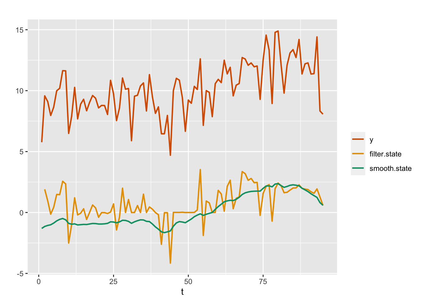
FIGURE 4.2: Observed data (red) and posterior means from filtered (yellow) and smoothed (green) distributions for the AR(1) with level plus noise model (Model 1).
The plot of the marginal posterior distribution of \(\phi\) is shown in Figure 4.3.
plot(
  inla.smarginal(model.ar1$marginals.hyperpar$`Rho for id.x`),
  main = "",
  xlab = expression(phi),
  ylab = "density",
  type = "l"
)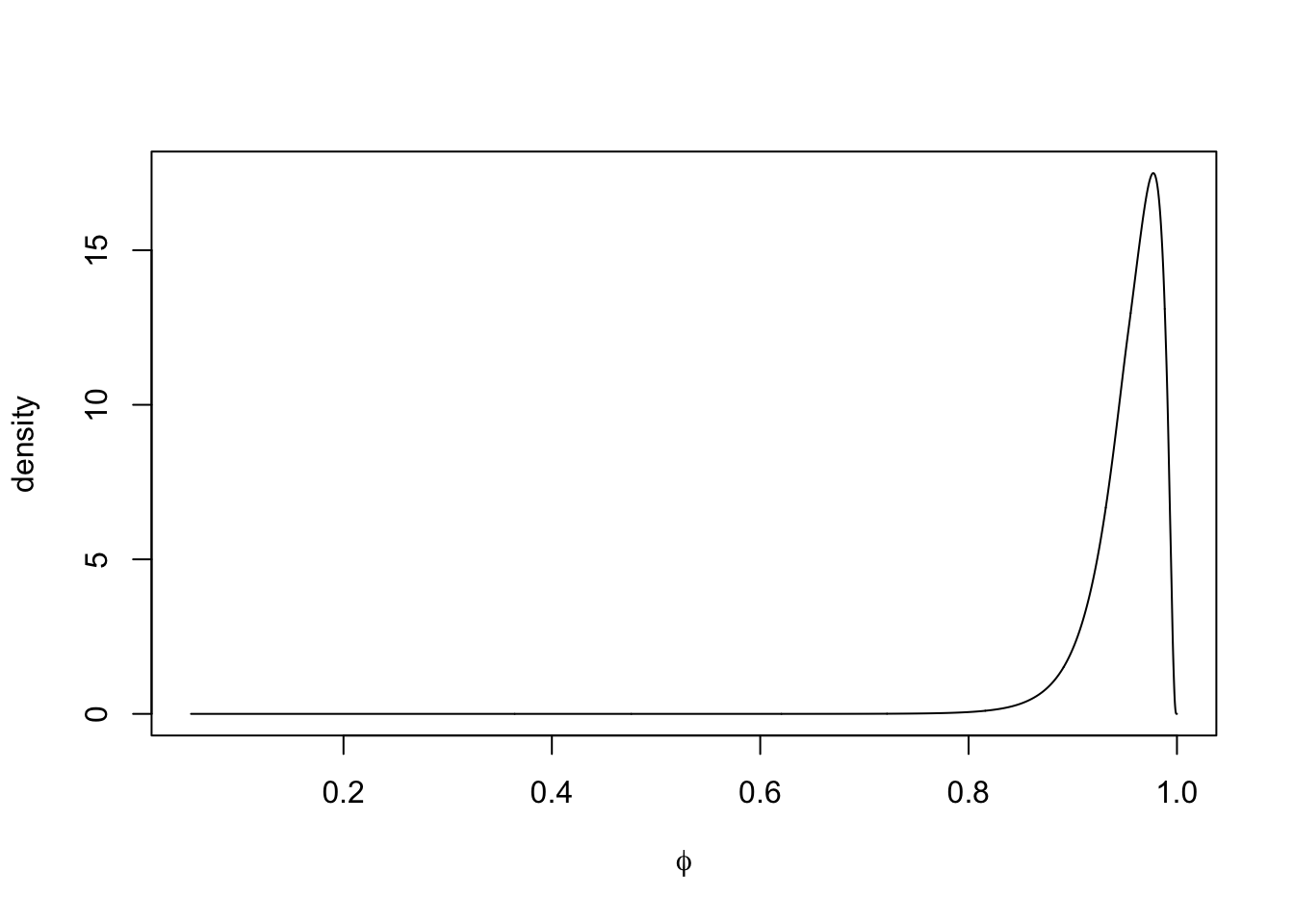
FIGURE 4.3: Marginal posterior density of \(\phi\) in Model 1.
For each model, it is useful to recover and assess the residuals for model adequacy, by verifying that the sample ACF plot behaves like that of a white noise series; see the top left panel in Figure 4.9.
resid.ar1 <- y - fit.ar1
acf.ar1 <- acf(resid.ar1,plot = FALSE)
4.2.2 Model 2. Random walk plus noise model
We fit a random walk plus noise model to the Musa data, with observation and state equations given by (1.15) and (1.16).
Note that we denote the state random effect by id.w in this model, which is different than the id.x we used for the AR(1) model. This helps us keep in mind the difference in what R-INLA outputs for the state precisions in the two models. We first fitted a model with level \(\alpha\); however, since the estimated \(\alpha\) indicated that the level was close to \(0\), we show below results from a model without level \(\alpha\) in the observation equation (by including \(-1\) in the formula below).
id.w <- 1:length(y.append)
musa.rw1.dat <- cbind.data.frame(y.append, id.w)
formula.rw1 <- y.append ~ f(id.w, model = "rw1", constr = FALSE) - 1
model.rw1 <- inla(
  formula.rw1,
  family = "gaussian",
  data = musa.rw1.dat,
  control.predictor = list(compute = TRUE),
  control.compute = list(
    dic = TRUE,
    waic = TRUE,
    cpo = TRUE,
    config = TRUE
  )
)
summary.rw1 <- summary(model.rw1)
format.inla.out(model.rw1$summary.hyperpar[,c(1:2)])
##   name                       mean  sd
## 1 Precision for Gaussian obs  0.40  0.062
## 2 Precision for id.w         19.13 15.332
Note that in this case, the posterior mean of \(\sigma^2_w\) can be obtained as 0.0844 using the code given below.
sigma2.w.post.mean.rw1 <- inla.emarginal(
  fun = function(x)
    exp(-x),
  marginal = model.rw1$internal.marginals.hyperpar$`Log precision for id.w`
)
Plots of the posterior means from the filtering and smoothing distributions from the random walk plus noise model (Model 2) are shown in Figure 4.4. In this model also, the fitted values of \(y_t\) correspond to the smooth estimates of \(x_t\).
FIGURE 4.4: Observed data (red) and posterior means from the filtering (yellow) and smoothing (green) distributions for a random walk plus noise model (Model 2).
In Figure 4.1, the plot of the data showed an upward trend over time. As we usually do in time series analysis, we can include a term
\(\beta t\) in the observation equation to account for this effect. This will be discussed next. In our development, we show the R-INLA model formulations, followed by plots of observed and fitted values, but suppress the detailed output. These can be seen in the GitHub page for our book.
4.2.3 Model 3. AR(1) with trend plus noise model
Previously, we fitted an AR(1) with level plus noise model (Model 1); now the model includes a time trend \(\beta t\) which is indicated by the fixed effect term trend in the
formula. This model does not include an intercept \(\alpha\) in the observation equation.
The observation equation is
\[\begin{align} y_t = \beta t + x_t + v_t, \tag{4.3} \end{align}\] while the state equation is the same as in Model 1, i.e., (1.20). Since \(\phi\) is close to \(1\), the user may fit a random walk with trend plus noise model instead of the AR(1) with trend plus noise model, and compare it with the other models.
id.x <- trend <- 1:length(y.append)
musa.ar1trend.dat <- cbind.data.frame(id.x, y.append, trend)
formula.ar1trend <- y.append ~ f(id.x, model = "ar1") + trend -1
model.ar1trend <- inla(
  formula.ar1trend,
  family = "gaussian",
  data = musa.ar1trend.dat,
  control.predictor = list(compute = TRUE),
  control.compute = list(
    dic = TRUE,
    waic = TRUE,
    cpo = TRUE,
    config = TRUE
  )
)
Partial output is shown below. Plots of the actual versus fitted values are shown in Figure 4.5. Unlike the random walk plus noise model, the fit does not show the smoothed \(x_t\) values, but rather the smoothed values plus the estimated trend.
# summary(model.ar1trend)
format.inla.out(model.ar1trend$summary.fixed[,c(1:5)])
##   name  mean  sd    0.025q 0.5q  0.975q
## 1 trend 0.074 0.043 -0.009 0.074 0.158
format.inla.out(model.ar1trend$summary.hyperpar[,c(1:2)])
##   name                       mean  sd
## 1 Precision for Gaussian obs 0.429 0.074
## 2 Precision for id.x         0.076 0.050
## 3 Rho for id.x               0.992 0.008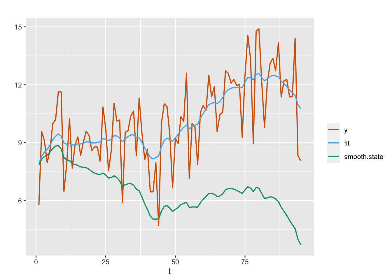
FIGURE 4.5: Observed (red) and fitted (blue) responses and posterior means from the smoothing distribution (green) for the AR(1) with trend plus noise model (Model 3).
The ACF plot of the residuals from Model 3 will be shown in Figure 4.9.
fit.ar1trend <- model.ar1trend$summary.fitted.values$mean[1:n.train]
resid.ar1trend <- y - fit.ar1trend
acf.ar1trend <- acf(resid.ar1trend, plot = FALSE)
We note that the posterior distribution of the trend coefficient \(\beta\) is concentrated around positive values (see Figure 4.6), implying the global upward trend in the data.
plot(
  inla.smarginal(model.ar1trend$marginals.fixed$trend),
  type = "l",
  main = "",
  xlab = expression(beta),
  ylab = "density"
)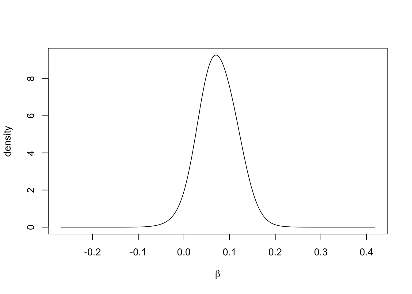
FIGURE 4.6: Marginal posterior of the trend coefficient \(\beta\) in Model 3.
4.2.4 Model 4. AR(2) with level plus noise model
We next consider an AR(2) with level plus noise model without a trend. The observation and state equations are given in (3.7) and (3.8), with \(p=2\), i.e.,
\[\begin{align} y_t &= \alpha + x_t + v_t;~~ v_t \sim N(0, \sigma^2_v), \tag{4.4} \\ x_t &= \sum_{j=1}^2 \phi_j x_{t-j} + w_t;~~ w_t \sim N(0, \sigma^2_w). \tag{4.5} \end{align}\] Plots of the posterior means of \(x_t\) from the filtering and smoothing distributions for Model 4 are shown in Figure 4.7, together with the observed time series.
id.x <- 1:length(y.append)
musa.ar2.dat <- cbind.data.frame(id.x, y.append)
formula.ar2 <- y.append ~ 1 + f(id.x,
                                 model = "ar",
                                 order = 2,
                                 constr = FALSE)
model.ar2 <- inla(
  formula.ar2,
  family = "gaussian",
  data = musa.ar2.dat,
  control.predictor = list(compute = TRUE),
  control.compute = list(
    dic = TRUE,
    waic = TRUE,
    cpo = TRUE,
    config = TRUE
  )
)
# summary(model.ar2)
format.inla.out(model.ar2$summary.fixed[,c(1:5)])
##   name      mean  sd    0.025q 0.5q  0.975q
## 1 Intercept 9.999 1.028 7.863 10.01 12.04format.inla.out(model.ar2$summary.hyperpar[,c(1:2)])
## name mean sd
## 1 Precision for Gaussian obs 0.419 0.067
## 2 Precision for id.x 0.528 0.320
## 3 PACF1 for id.x 0.960 0.027
## 4 PACF2 for id.x 0.035 0.179
FIGURE 4.7: Observed data (red) and posterior means from the filtering (yellow) and smoothing (green) distributions for an AR(2) with level plus noise model (Model 4).
Plots of the marginal posterior distributions of the hyperparameters \(\phi_1\) and \(\phi_2\) are shown in Figure 4.8. The posterior mean of \(\phi_2\) is concentrated around \(0\), suggesting that the AR(1) model is more appropriate for this series.
n.samples <- 10000
pacfs <- inla.hyperpar.sample(n.samples, model.ar2)[, 3:4]
phis <- apply(pacfs, 1L, inla.ar.pacf2phi)
par(mfrow = c(1, 2))
plot(
  density(phis[1, ]),
  type = "l",
  main = "",
  xlab = expression(phi[1]),
  ylab = "density"
)
plot(
  density(phis[2, ]),
  type = "l",
  main = "",
  xlab = expression(phi[2]),
  ylab = "density"
)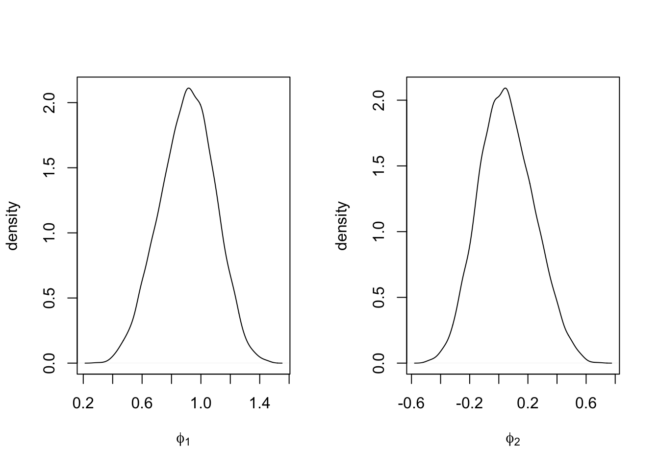
FIGURE 4.8: Marginal posterior densities of \(\phi_1\) (left panel) and \(\phi_2\) (right panel) under Model 4.
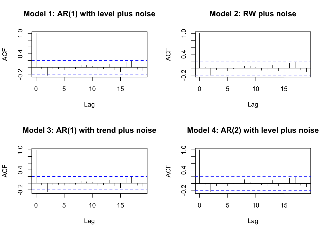
FIGURE 4.9: Sample ACF plots from Model 1–Model 4.
In Section 4.4, we will compare these models based on in-sample model criteria such as DIC, WAIC, and PsBF. In Section 4.3, we see how to use R-INLA to forecast future states and observations.
4.3 Forecasting future states and responses
Given training data \(y_1,\ldots, y_{n_t}\), estimates of the states \(x_1,\ldots, x_{n_t}\) and the estimates of model hyperparameters \(\boldsymbol{\theta}\), we forecast \(x_{n_t+\ell},~\ell=1,\ldots,n_h\). For \(n_t=95\) and \(n_h=6\), we show below forecasts for the future latent states for time periods from \(t=96\) to \(t=101\). See Section 3.7 for more details.
# Forecast the state variable
format.inla.out(tail(model.ar1$summary.random$id[,c(1:6)]))
##   ID  mean  sd    0.025q 0.5q  0.975q
## 1  96 0.568 1.132 -1.704 0.572 2.878
## 2  97 0.547 1.166 -1.809 0.555 2.910
## 3  98 0.527 1.193 -1.893 0.537 2.938
## 4  99 0.508 1.217 -1.964 0.518 2.963
## 5 100 0.490 1.236 -2.023 0.500 2.984
## 6 101 0.472 1.253 -2.074 0.482 3.001
We then obtain forecasts of \(y_{n_t+\ell}\) for \(\ell=1,\ldots,n_h\).
format.inla.out(tail(model.ar1$summary.fitted.values[,c(1:5)]))
##   name         mean  sd    0.025q 0.5q  0.975q
## 1 fit.Pred.096 10.58 0.891 8.664  10.64 12.18
## 2 fit.Pred.097 10.56 0.955 8.493  10.63 12.27
## 3 fit.Pred.098 10.54 1.009 8.358  10.61 12.35
## 4 fit.Pred.099 10.52 1.055 8.245  10.59 12.43
## 5 fit.Pred.100 10.51 1.094 8.149  10.57 12.49
## 6 fit.Pred.101 10.49 1.128 8.067  10.55 12.55
Using similar code, we can obtain forecasts for \(y_{n_t+1},\ldots, y_{n_t+n_h}\) from Model 2–Model 4. Figure 4.10 shows plots of the training portion of the time series as well as the forecasts and forecast intervals (gray shaded region) from all four models. The shaded area is the interval at each time point between the lower limit (forecast minus twice the forecast standard deviation) and the upper limit (forecast plus twice the forecast standard deviation).
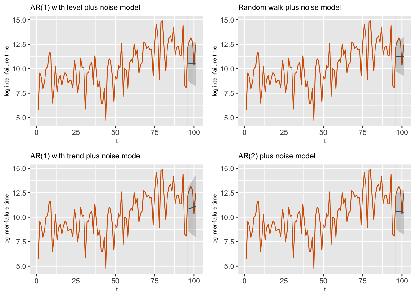
FIGURE 4.10: Observed data along with forecasts from Model 1–Model 4 for the last six observations. The gray shaded region shows the forecast intervals based on 2 standard deviation (sd) bounds around the means of the posterior predictive distributions. The black vertical line splits the data into training and test portions.
4.4 Model comparisons
In the next two sections, we present model comparisons.
In-sample comparisons
The DIC, WAIC, and CPO criteria for the
fitted models are obtained using control.compute=list(dic=TRUE, waic = TRUE, cpo = TRUE) during model fit:
model.ar1$dic$dic
## [1] 368.9
model.ar1$waic$waic
## [1] 371
cpo.ar1 <- model.ar1$cpo$cpo
(PsBF.ar1 <- sum(log(cpo.ar1[1:n.train])))
## [1] -186.1
The custom function model.selection.criteria() (see Section 14.3) allows us to print the DIC, WAIC and PSBF values from a model. For example, we can obtain these for the AR(1) with level plus noise model (Model 1) as shown below.
model.selection.criteria(model.ar1, plot.PIT = FALSE, n.train = n.train)
##        DIC WAIC   PsBF
## [1,] 368.9  371 -186.1
R-INLA outputs the marginal likelihood on the logarithmic scale by default; for example the marginal likelihood from Model 1 is:
model.ar1$mlik
##                                         [,1]
## log marginal-likelihood (integration) -211.2
## log marginal-likelihood (Gaussian)    -211.2
From Table 4.1, we see that the criteria are quite similar for four models. The DIC criterion suggests that either the AR(1) with trend plus noise model seems to give the best fit to the data, while the other models are also competitive.
Out-of-sample comparisons
We defined out-of-sample criteria such as MAPE and MAE in Chapter 3; see (3.27) and (3.28). The codes to compute MAE and MAPE can be accessed from the custom functions; see Section 14.3. The out-of-sample validation based on forecasting the hold-out data for the AR(1) with level plus noise model (Model 1) is shown below. These criteria can be similarly computed for the other models.
yfore.ar1 <- tail(model.ar1$summary.fitted.values)$mean
yhold <- test.data$log.tbf
efore.ar1 <- yhold - yfore.ar1 # forecast errors
mape(yhold, yfore.ar1, "MAPE from AR(1) with level plus noise model is")
## [1] "MAPE from AR(1) with level plus noise model is 14.25"
mae(yhold, yfore.ar1, "MAE from AR(1) with level plus noise model is")
## [1] "MAE from AR(1) with level plus noise model is 1.807"
The MAPE and MAE values from Table 4.1 are lowest for the random walk plus noise model (Model 2), with the AR(1) with trend plus noise model being a close second.
| Model | DIC | MAPE | MAE |
|---|---|---|---|
| AR(1) with level plus noise | 368.9 | 14.25 | 1.807 |
| Random walk plus noise | 370.1 | 10.82 | 1.344 |
| AR(1) with trend (no level alpha) and noise | 368.5 | 12.40 | 1.551 |
| AR(2) plus noise | 368.7 | 14.04 | 1.778 |